About the early visuals of the game and their main concepts
As we approach our second milestone, I wanted to write this blogpost about some aspects and core ideas regarding the visuals of our game. In our workflow, we design everything together by bringing ideas and sketches and by discussing a lot. I then produce a first draft using the almighty superior pixel art software aseprite, and when everything seems OK I proceed with the animations before we implement them in Unity.
Note on workflow
As I have no clue on how Unity (and game programing in general) works, Giezi created and implemented many tools to help me gain an efficient workflow as I need to import and adjust my work in the software. All this process took time and I still need to to reach him to ask many questions, but I really feel we have gained a lot more efficiency by proceeding like this. Hopefully, it will pay in the long run!
Keep in mind that everything is still a work in progress and a lot of things may be subject to change.
Core Ideas
We are mainly still following the artistic direction we took while developing the jam project, but there is many things we have to adjust in order to bring the jam entry to a full game.
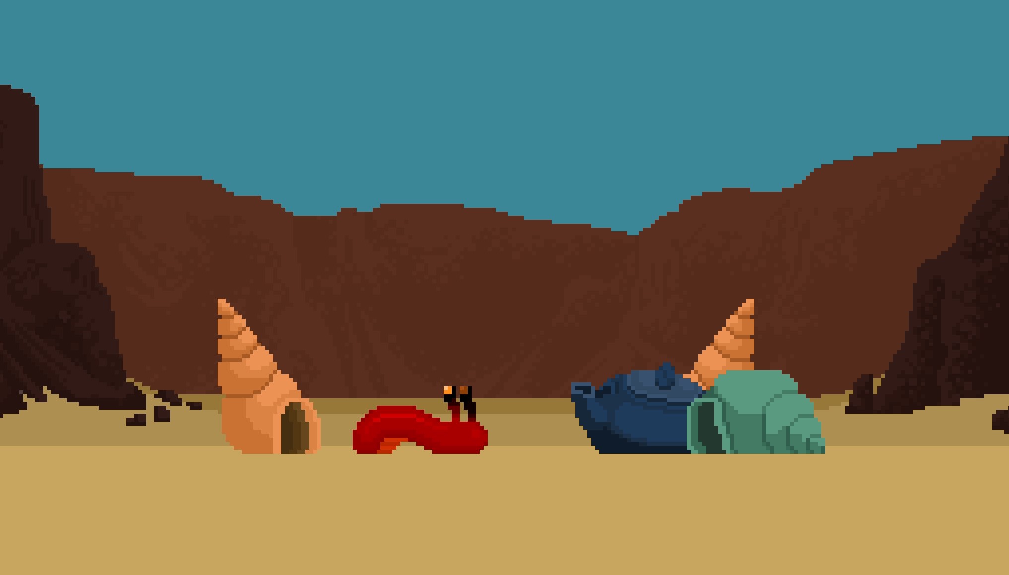
Most of the creature in the game will have this theatrical posture (¾ view) in order to look more “natural” as we avoid using completely symmetrical sprites and can work around more complex animations. Regarding the background, we want to keep this theatrical feel by working with “flat” layers which appear just like a theater scene with a small number of layers. The first thing I changed when I was working on the new sprites was their scale. During the jam, we worked with small sprites and very simple visuals in order to keep an efficient workflow. For the full game, we want to be able to further develop the visual characteristics of the various creatures in order to toy around with their personalities and mood. I was able to bring this whole new dimension in the visuals by working with slightly bigger sprites except for the hermit. We choose to keep the original design as a neutral little bright red slug. The new scale allow me to reinforce the feeling of softness (and weakness) of the player by stretching and squashing the sprites. The player must feel malleable and slippery while escaping the many threats he will be facing in the game.
Realism ?
Finding the correct tone between cartoons and a more realistic approach is really difficult for me. All characters in the game are given cartoonish traits to amplify their personality and behavior, but we still want to blend in some realistic elements to them. Finding the correct balance between realism and cartoon can result in back-and-forth changes regarding the visuals of the game. For example, after some tests, we chose to give to all the crabs a regular “human looking” mouth (just like in the jam project). As a result, it is easier for us to “feel for them” by giving them a typical human mood or expression that goes along any specific behavior.
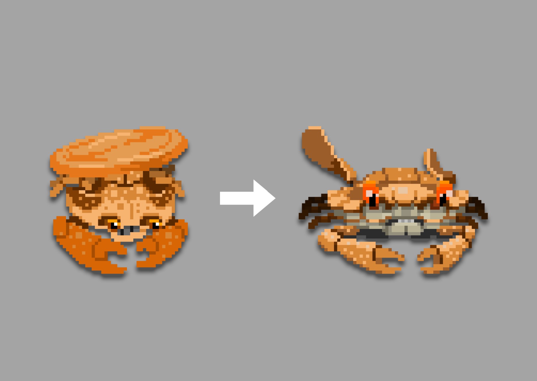
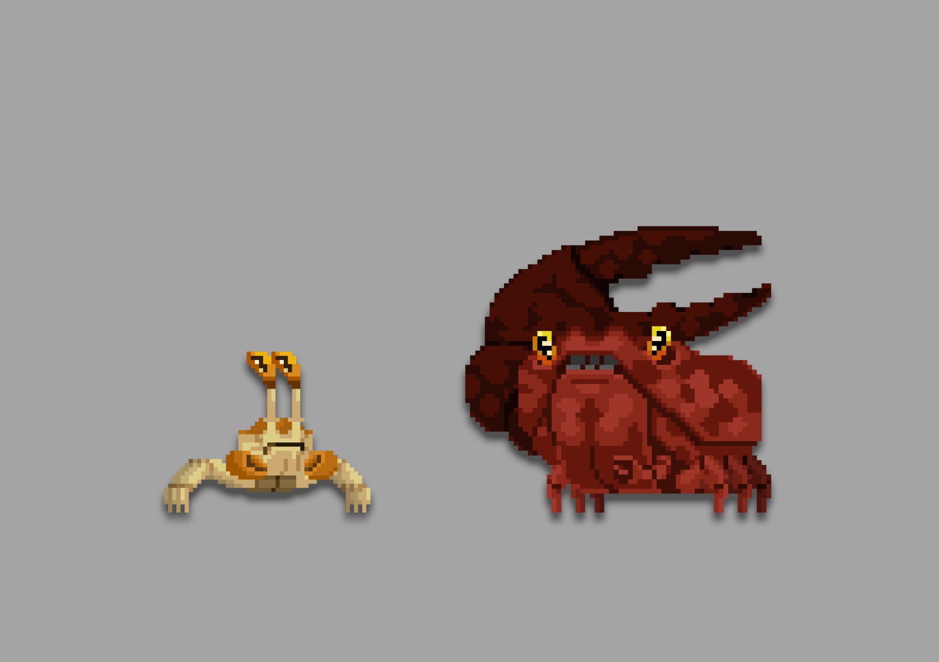
The evolution of the orange crab can be an example as in the first version, I tried to distance my work from realism and used a more cartoonish approach. The result was not satisfying and it was very frustrating for me to see it implemented in the game as we needed to go further in the development. I did a new version later and I chose to be closer to a certain amount of realism. I felt the result was much better overall and blending nicely among the other enemies in the game.
Colors
Speaking about colors in the game, we are still experimenting with various approaches, but we want them to support some basics game design rules. The player is bright red, one of the most saturated element, to make the hermit stand out. The enemies will be slightly more toned down regarding their colors. Overall, the enemies and the shell will be using a slightly more pastel palette of colors while the background element will be using a specific group of colors per area. As the plot is slowly unfolding in the first biome, we choose a warm palette of various brown and ocher tints for the reefs and minerals (flora is still a WIP at this time, but comming very soon!).
Crabs, crabs & crabs
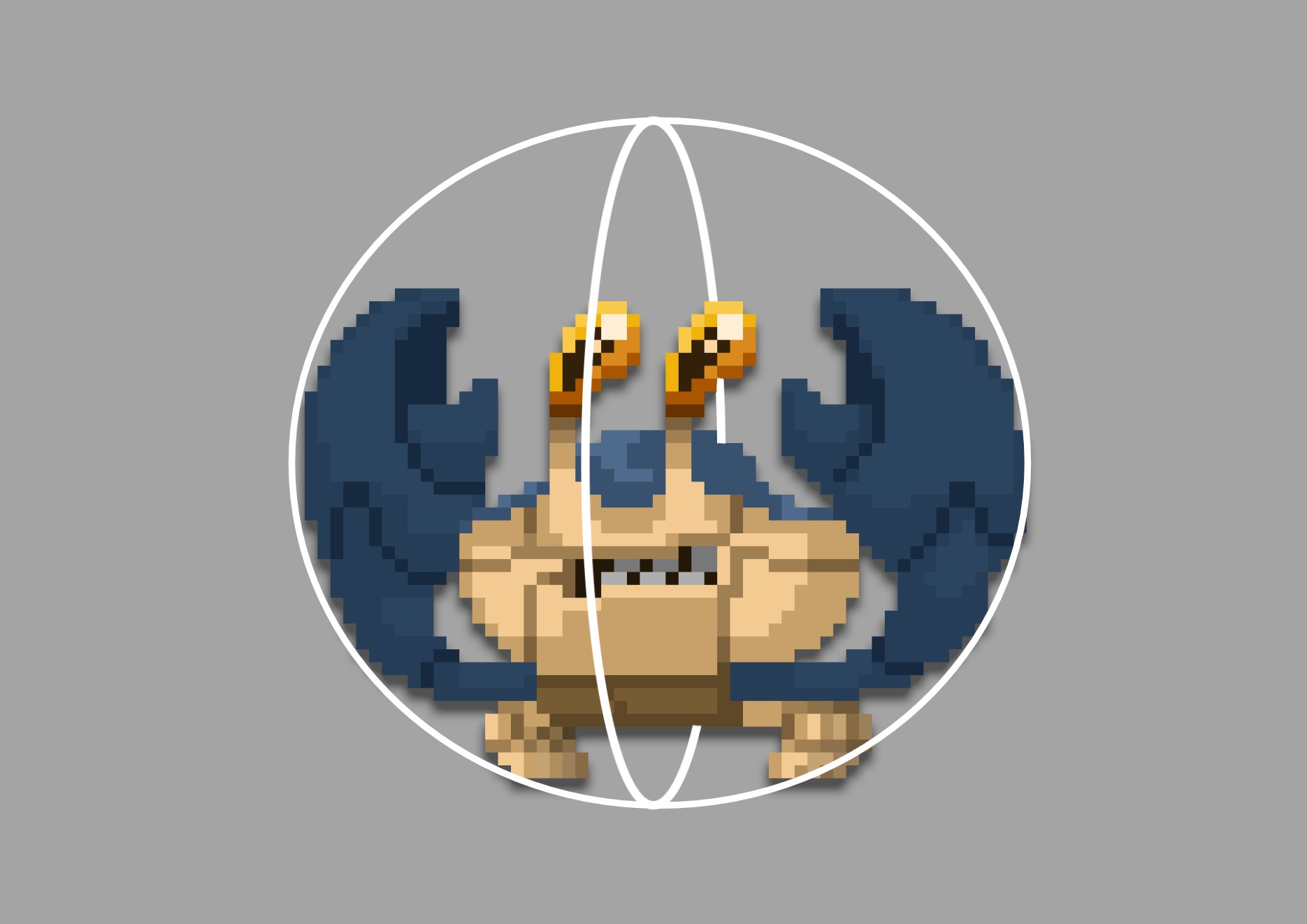
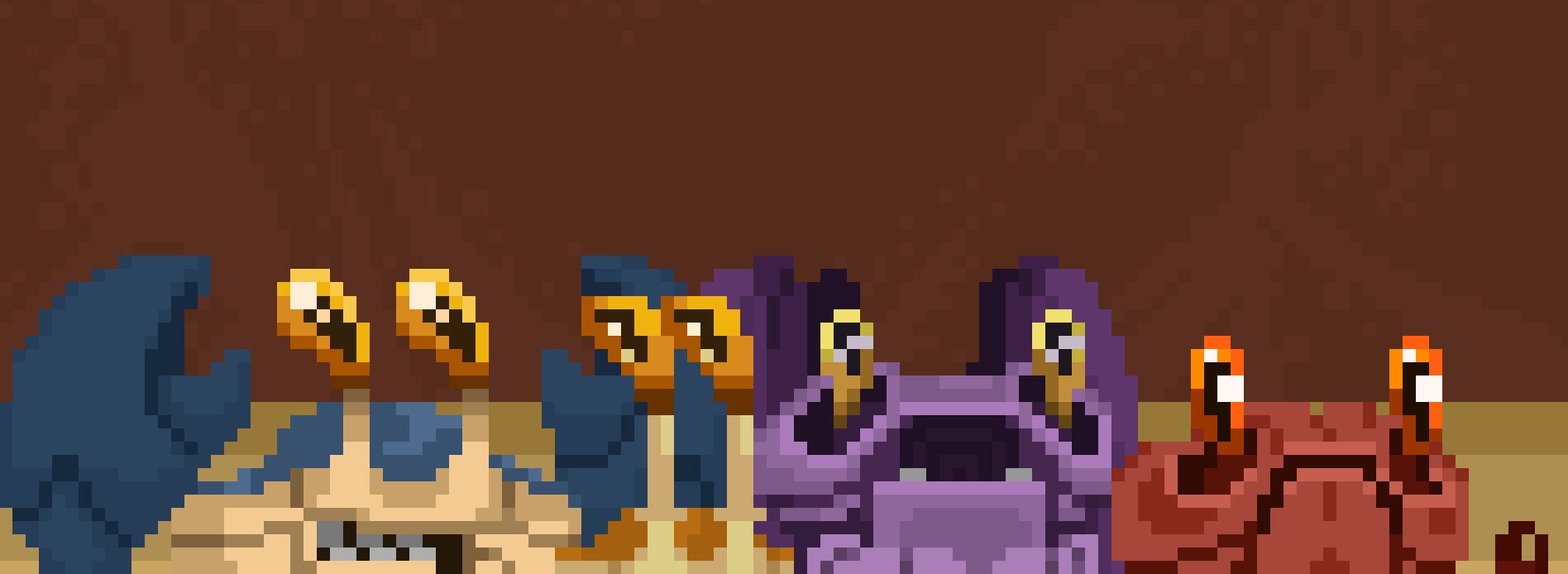
Regarding the first foes, we chose to start with a bunch of crabs. I began working around simple shapes in combination with different colors to create specific looking enemies. All those foes will each have a specific behavior and their appearance will be the first clue about it. This way, the player can immediately recognize them as they enter the stage and quickly react to them. The long and open legs of the yellow crabs tells us about his ability to move very quickly. The posture of the violet one is similar to the frog as he jumps the same way. As those crabs will be the first enemies faced by the player, we designed them as low threatening creatures. They are following a very specific pattern and are not trying to actively hunt the player. To reinforce this idea, we gave them this weird and anxious look as they also fear for their life facing the hermit.
Even more crabs
To spice up a bit the pacing of this first level, we implemented a mini-boss, which is a small violinist crab with a very big and heavy claw. Based on a very obvious mechanic, he is dragging his claw as a burden. In order to attack the player, he has to spin on himself to throw his giant claw into the air and he will eventually be dragged by it and become a living cannon ball. At this point, we had various foes with a variety of distinctive looks and behaviors, but all of them are small sized.
We had the urge to try to implement a bigger creature so we designed a medium sized and more slow paced crab. He carries his claw as a big sword on his shoulders so the player knows he can use it as a weapon. We chose to give him a simple behavior to make him a relatively easy to defeat enemy as we are currently developing the first area of the game. He is the first creature to change his behavior regarding the player’s position in the screen and will only attack when he can reach the hermit by slamming its claw.
Double trouble
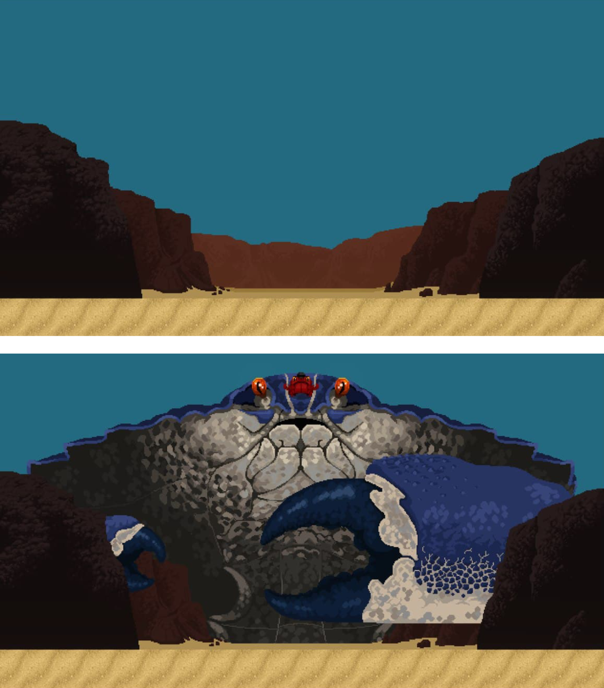
For the boss we wanted to push the boundaries of the game by working on a giant creature that will occupy the whole screen. For me, it was the first time I had to design such a large creature. I am still trying to figure out the right amount of details I can work with in order to make it blend naturally with the rest of the visuals in the game. Until now, the player’s attention was mostly driven to the inferior part of the screen, and even the background of the level doesn’t reach the upper part of the screen that stays nearly empty for the whole level. To make the boss fight stand out, we designed the boss in such a way that his arrival completely reconfigures the topology of the level. This giant crab needs to feel real and very imposing, I also gave him a more threatening aura, as the challenge goes up for the fight. The attention of the player must be driven to the very top of the screen where the true boss of the stage lies, the small red one. I tried to use a combination of color and a cluster of details around the “head” of the giant crab to give clues to the player on how to fight the boss (by defeating the small one).
What’s next?
This post was mainly and opportunity for me to write about very generic concepts in our game, I hope it was a good read to you and I’m looking forward to write a more in-depth post about the progression of my work along the development of hermit – an underwater tale. Thanks for reading!
Read the latest articles:
Updating the bug reporting tool
Early Coffee Games at GDC 2022 in San Francisco!
Scroll Rect - automatic scroll with elements navigation


